Posts

Welcome!

  Welcome, Designers! I am happy you have arrived here. I hope something about graphic design and digital art has sparked your interest, and maybe this semester that spark will turn to flame.  Here are some of the best ways students have found to be successful in our beginning photography course:                                                                                                                        1. Work  thoughtfully & mindfully  so others may do the same. 2. Be  prompt, on-time, present and remain  in the studio. 3.  Listen  carefully and be  courteous  when others are talking or demonstrating. 4. Always use time  productively . 5. Insure your language, comments and projects  appropriately follow  TuHS school handbook guidelines. 6.  Demonstrate  a positive approach to assignments. 7.  Positively receive  feedback and critique. 7. Pursue  challenging  solutions & strive for  high standards  of achievement. 8. Keep track of – and  clean up  – materials, and co

ALBUM COVER ART / CONCERT FLYER / MOVIE POSTER

Image
DIRECTIONS. Using your skill and knowledge in/of Photoshop, create an album cover or concert poster/flyer. Use of fonts/type/typography will be discussed in the next two class periods. WHEN IS IT DUE? This design challenge is your final.  The image will be due on Friday, June 9. If you need to use the final class period to finish, let me know verbally in class.  WHAT YOU SHOULD DO. Choose any genre, artist, etc. - modern or classic...even classical.  Make up tour dates/times, cities, concert venues, catch phrases, etc. Use photos & graphic from online, but make sure the images you gather are high resolution.  Think about the TONE and SPIRIT of the music you're advertising.  Choose typography that mirrors the tone and spirit of the music. Matching typography to the artist is important.  If choosing to do an album cover, create a canvas that is 12in x 12in. If choosing to make a concert flyer, create a canvas that is 11in width x 14in height Then begin... Have fun with this

COLLAGE ILLUSTRATION -or- SCAPE #3

Image
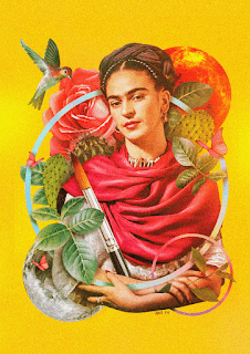
  COLLAGE ILLUSTRATION  -or-  'SCAPE 3:  A  'SCAPE  that is entirely of your own creation, and incorporates  10+ elements. The 'scape can be a cityscape, landscape, surreal scape, dream scape...it does not need to grounded in reality. Odd, unexpected, surprising are good.  -or- An  COLLAGE ILLUSTRATION  that incorporates  10+ elements  (including, but not limited to photographic collage, use of text, color application through paint/brushes, and...) Some ideas on which to base your illustration: -a poem -a theme from a book -a song lyric -an album cover -a concert poster/flyer -a personal belief mantra or phrase -a political movement/cause in which you believe -a personal life philosophy -an homage to a figure/hero -a critique of an idea -the front cover of a greeting card -a commentary about a cause/issue near to your heart & mind -something of your choosing... *All imagery used must meet TTSD guidelines for school conduct. Ask if you are unsure. To begin:  1. Conduct a

'SCAPES 1 & 2

Image
'SCAPE 1: LAND A Landscape with only land elements  (combine FOUR+ land elements) SCAPE #1 Components Yes, this example shows the three MAIN distances (fore/middle/back).  Add in ONE+ extra component at any of the distances.  'SCAPE 2: LAND+ A landscape that incorporates and integrates (through careful selection/erasing/cloning) SIX+   animal/humans/object elements COLLAGE ILLUSTRATION -or- 'SCAPE 3:  A  'SCAPE that is entirely of your own creation, and incorporates 10+ elements. The 'scape can be a cityscape, landscape, surreal scape, dream scape...it does not need to grounded in reality. Odd, unexpected, surprising are good.  -or- An COLLAGE ILLUSTRATION that incorporates 10+ elements (including, but not limited to photographic collage, use of text, color application through paint/brushes, and...) Some ideas on which to base your illustration: -a poem -a song lyric -an album cover -a concert poster/flyer -a personal belief -a political movement/cause -a perso

Welcome Spring 2023!

  Welcome, Designers! I am happy you have arrived here. I hope something about graphic design and digital art has sparked your interest, and maybe this semester that spark will turn to flame.  Here are some of the best ways students have found to be successful in our beginning photography course:                                                                                                                        1. Work  thoughtfully & mindfully  so others may do the same. 2. Be  prompt, on-time, present and remain  in the studio. 3.  Listen  carefully and be  courteous  when others are talking or demonstrating. 4. Always use time  productively . 5. Insure your language, comments and projects  appropriately follow  TuHS school handbook guidelines. 6.  Demonstrate  a positive approach to assignments. 7.  Positively receive  feedback and critique. 7. Pursue  challenging  solutions & strive for  high standards  of achievement. 8. Keep track of – and  clean up  – materials, and co

THE PAINTED PORTRAIT

Image
Link to the slides CLICK HERE. DIRECTIONS FOR OUTLINING: 1. Make a few dramatically-illuminated portraits of someone (or yourself). Dramatic facial expressions will make your final image... 2. Open the photo(s) in Photoshop and identify the areas of value. 3. Create a NEW LAYER  (transparent) over the background. This layer will hold the black outlines you will draw in the next step.  4. Set the PENCIL or PEN tool to 5-6px in width, with HARDNESS set to 100% 5. Carefully, with black pencil or pen, outline the different observable areas of value.  DIRECTIONS FOR PAINTING: 1. Go to  https://color.adobe.com/create/color-wheel 2. After exploration, choose an intentional color scheme for use in painting your image.     - Screencap the scheme of your choice: This color scheme screencap will be posted to your site along with the final image.  3. Open the screencap in Photoshop to use with the EYEDROPPER tool for color selection 4. General painting guidance: A. Paint the areas of HIGHLIGH

'SCAPES 1-3

Image
WHAT IS DUE . 'SCAPE 1:  A Landscape with only land elements  (combine FOUR+ land elements) 'SCAPE 2:  A landscape that incorporates and integrates (through careful selection/erasing/cloning) six or more  animal/humans/object elements 'SCAPE 3:  A 'scape that is entirely of your own creation  (three+ added elements).  This can be a cityscape, landscape, surreal scape, dream scape...it does not need to grounded in reality. Odd, unexpected, surprising are good.  *A total of THREE  separate Photoshop designs/composites will need to be created to be scored.  **Total points possible: 12 (4 points per 'scape) RATIONALE  (WHY ARE WE DOING THIS?) To practice and focus skills in Photoshop regarding  layers ,  placing/rasterizing , adjusting  color/value ,  edit+transforming  selections,  selection  tools. THE THREE IMAGES. Create  THREE  separate  'scape  composite images. Use very high-resolution images (1000x1000 minimum) from image searches. See links below.